

")
If you’ve ever ordered a t-shirt online that was printed with Direct to Garment, chances are the printed colors looked completely different than what you saw on the screen.
Unfortunately, color shifts are a common problem with dtg printing. In this article, we’ll discuss why this is and give you some tips on how you can increase color accuracy as a designer and as a printer.
Why do colors print incorrectly in direct to garment printing?
Incorrect colors and color accuracy are well-known nuisances in direct-to-garment printing. However, the problem has more than one cause. Both the printer and the design can cause printing inconsistencies. Most of the time, it’s a combination of both.
One possible reason for color shifts is that the printing process is not consistent and repeatable. For example, a small variation in the amount of pre-treatment applied to the garment can already cause an unintentional ripple effect. If there is less pre-treatment, the white ink will look less white, and therefore the printed colors will look different. You can compare this to drawing on cream-colored paper versus pure white paper. If the printheads are not well maintained, missing nozzles can also cause a different result.
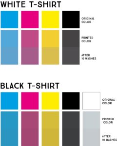
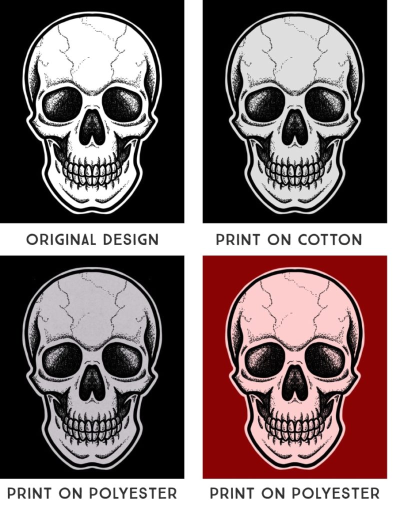
The garments you are printing on can also cause color changes. Depending on the material and color of the garments, the result may vary greatly.
Another cause is if the direct to garment printer is not calibrated. When you calibrate the printer, you create a printer profile. This gives the printer all the information it needs to translate the colors within a design into printed dots as correctly as possible.
However, the problem with printer profiles is that they only work for a combination of pre-treatment, printer, garment type, and garment color. This means that you would have to create a separate profile for each T-shirt color. And for each t-shirt type. And for each brand. You get the idea. That’s a lot of profiles!
Most printers don’t just print the same white t-shirt. Usually, the customer can choose from a variety of garments and garment colors. Therefore, the number of profiles you would need to create to cover regular production can be quite overwhelming.
Often the design is in a color profile that doesn’t match what the printer can actually reproduce. The problem with this is that there is no information available to designers about what profile to use and what colors can be embedded in a design.
In some cases, designs were not created for DTG printing. When designs have been created for other printing methods, such as screen printing, the design’s colors often serve only as placeholders. Thus, it regularly happens that the embedded color value is not the best suited to achieve a certain result.
The last reason is an uncalibrated monitor and wrong viewing conditions.
Another thing you should do is to take a look at your working environment, especially your monitor. If you have a monitor calibration device, you should do that. But I would guess that 99% of t-shirt designers don’t do this, including us. These devices are expensive, and a calibrated monitor is only half the battle.
So, as we mentioned, we don’t do that either.
That being said, there are two steps you should take to improve how your design looks on your monitor:
1) Make sure you turn off night mode on your monitors. This usually adds a yellow cast to your screen and changes the look of the colors.
2) Set the brightness of your monitor higher.
The last reason is that print results are often judged under incorrect viewing conditions. Colors can change with the light. That’s why strawberries always look red and juicy in the supermarket, and when you get home, they don’t look so delicious anymore. Ideally, print results are evaluated in a standard viewing environment. It would be best if you also had a controlled environment to judge colors properly. For example, your colors will only look right in a completely dark room with standard lighting.
Choosing colors for DTG printing designs
The situation can be particularly tricky for designers in direct-to-garment printing. Most of the factors that affect the printed color discussed above are beyond the designer and the client’s control.
Which colors can you use for DTG printing?
There is no information about which colors are actually printable and therefore can be embedded in a design.
We generally recommend not worrying too much about the colors you use for your direct-to-garment printing designs.
First, be aware that there will always be color changes. If you have to use a certain Pantone color for your brand, you might be better off using a different printing process like screen printing.
Secondly, even if the color is not printable, the printer will automatically match it to the closest alternative.
However, we always recommend putting a little thought into your color selection. For example, neon colors or gold cannot be reproduced by any inkjet printer, so the same goes for dtg printers. If you choose such colors, you can expect massive color changes.
DTG Color Matching
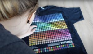
One hack we use to make what we print more predictable is color swatches.
For example, we design a lot of black t-shirts for Merch by Amazon. So we ordered a t-shirt with some color swatches (you can find them here). Now when we design a t-shirt, we go back to those color swatches, pick the ones we like, and use them in the design.
The design colors often look a bit strange, but the printed result is often closer to our imagination. But even this method is not 100% accurate because many factors influence the result.
But it helps a little because at least you can judge the color from the actual print and not from what you see on the monitor.
RGB vs. CMYK – How will it affect my direct to garment printing results
The question of whether you should use RGB or CMYK for your designs is a constant battle and a source of endless debate. The common “knowledge” is that RGB is appropriate for screens, and CMYK is appropriate for print. But that’s only true for paper printing. It is not necessarily true for DTG printing.
In many cases, the range of printable colors is much wider than CMYK. If you were to use a standard CMYK profile created for paper printing, you would be limiting yourself in terms of the colors you can use in your design. As we mentioned earlier, there are no profiles for direct-to-garment printers.
Therefore, our recommendation is to design in RGB.
We talk a lot about this topic in a recent video we posted on YouTube.
Print correct colors with your direct-to-garment printer
The best way to get accurate colors repeatedly with your printer is to create printer profiles. Many RIP software providers offer the ability to create profiles.
However, before you start, make sure your systems are optimized, and your printing process is stable. If you need some ideas on this, check out our online course on Direct-to-Garment Printing.
To limit the number of printer profiles you need to create, select a few types and colors of garments. Make these “staples” in your inventory and then optimize and profile your printer for them.
It’s important to train your employees. They need to keep the printing process consistent and repeatable and notice when things start to change.
When you print these profiled garments, you should at least give your customers a higher quality when it comes to color accuracy.
Color is not everything
Color accuracy is an issue in direct-to-garment printing that still needs a lot of attention. At the moment, there are many loose threads, and a lot of research and development needs to be invested in this area.
Unfortunately, color shifts must be expected in dtg printing at the moment. However, we still believe that the advantages of direct-to-garment printing far outweigh this.